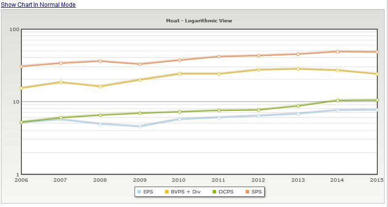
10 year Multi year Performance at a glance as a graph
The multi year performance is great (remember reading about this in F-Wall Street), however it would be nice to be able to switch to or see the actual numbers for the last 10 years as a graph.
Value: It would make it possible to form an opinion on how stable the company is at at glance and if the numbers correlate the way one would expect them to.
Possible use:
Phil Town talks about how he use certain growth values to indicate a company's moat. From his Rule one website:
Companies that have had a sustainable moat usually demonstrate consistent increase in the growth of Earnings per Share (EPS), Sales per Share, Book Value per Share (BVPS), and Operating Cash Flow per Share (OCPS). Review these numbers and charts to determine if
this company has had a sustainable advantage over its competition in the near past."
On his checklist he checks that all these growth rates have been above 10%, and he talks about how he use this to trigger questions if these graphs aren't parallel.
With the multi year performance it's easy to see the number by it self, but it's not seen at a glance how one number develop compared to another number.
I gave this as an example. I am sure others have other numbers from the performance table they would like to look at as well. (I know I do).
The graph would be laid out as years on the y-axis and % on the x-axis and the graphs would have different colors (I guess) for the different performances.
Like this: This is 3M. If the lines started to cross each other, I'd want to know why.

Customer support service by UserEcho

Hi Tobias,
Thanks for the suggestion.
Are you referring to the multiyear performance numbers from the DCF?
Yes that was my idea. Mostly because you seem to already have most of the numbers that would be interesting there (sort of). Some other growth numbers would be nice as well. Like book value growth, and sales growth, but I won't be greedy :)
My general "idea" is that a graph sometimes can show more than numbers laid out in a table. So I would like to see some development in that direction. Some of the numbers that would be interesting to see as a graph are located under the "multiyear performance numbers from the DCF".
I would think that many of numbers would be interesting regardless of valuation method, so that might not be the best place for it, but it seems be where some of this is today, so that might be the easiest place to put it.
the good news is that I'm trying to put as many mini charts as possible into places that make sense.
The comparison page will be just what you're looking for because you'll be able to customize the data points to view what is important to you.
Charts section in the future will allow you to chart all sorts of interesting numbers.
Great! I am looking forward to that! The most important thing is that we are able to put more than one graph into the same chart.